Skip to contents

Caitlin Malone

Accessible and engaging instructional design

Introduction

I worked on these projects in my role as an instructional designer (ID) with Teaching & Learning Technologies (TLT) at Indiana University (IU).

GenAI 101

Course screenshot. Full text description below image.

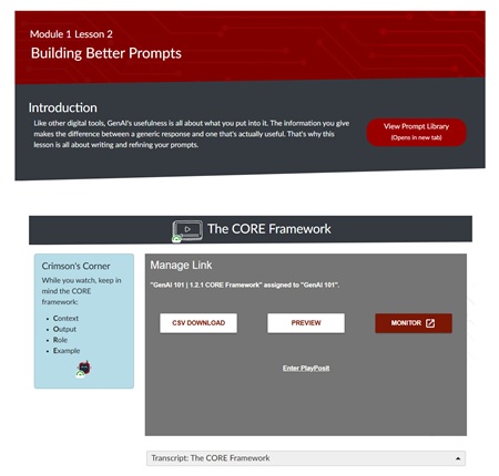
Indiana University's GenAI 101 course is currently believed to be the largest enrolled course on generative AI in US higher education institutions, and was featured in an article on Inside Higher Ed . It incorporates:

  • Short, engaging YouTube-style lecture videos
  • 8 scenario-based reflection activities
  • A detailed prompt library that learners can use in their own interactions with GenAI

I was part of a five-person team from Teaching & Learning Technologies responsible for building course pages in Canvas LMS. We collaborated with subject matter experts and a video production team from the Kelley School of Business' Brian D. Jellison Studios.

My Role

My contributions included:

  • Creating an accessible, innovative design using features from Cidi Labs' DesignPLUS sidebar
  • Ensuring the course meets accessibility standards. The course currently has a 98% rating in Anthology Ally, and required only minor changes after a review by accessibility experts and a screen reader user.
  • Writing short text to supplement videos, including: module and lecture page introductions; video summaries; and key takeaways on each lecture page.
GenAI 101 Accessibility

I ensured the course was accessible by:

  • Designing with accessibility and responsive web design best practices
  • Testing with screen readers (JAWS and NVDA) and zoom up to 200%
  • Iterating on feedback on page responsiveness from tests on mobile devices (iPhone and Android phones)
  • Providing accessibility guidance and feedback on video scripts to ensure visuals were described as much as possible
  • Writing alt text for supplementary images
  • Recommending tools that have passed accessibility reviews
  • Editing captions and creating video transcripts with visual descriptions
GenAI 101 Visual Design

When designing for this course, I kept in mind the following requirements from stakeholders:

  • Visuals must be eye-catching and engaging — it was very important for this to not feel like a standard college course, but also to be appealing to students, faculty, and staff
  • Adhere to Indiana University's official color palette (white, crimson, blue-black, and secondary colors including an additional blue)
  • Designs must work on both computer and mobile screens

Design elements included:

  • Home page, module overview, and lesson page templates, including angled blocks inspired by Cidi Labs' Geometric Design Home and Geometric Design Content pages
  • Image backgrounds modified from Adobe Stock
  • Creating modules and populating the home page, module overviews, and lesson pages with supplementary text

Accessibility Training Series

Since 2018, I have been compiling accessibility best practices from Indiana University's internal experts and training instructional designers in how to apply them in courses. This initiative included:

  • A thorough needs analysis
  • An accessibility basics training course for new hires
  • A public-facing best practices guide
  • Internal job aids for common tasks
  • A live training series with 13 sessions covering foundational and topic-specific best practices
  • Weekly tips and updates
  • Practice activities and group discussions
  • Updated documentation with accessibility fields
Training Needs Analysis

My needs analysis began by identifying key stakeholders (such as instructional designers and management) and determining their goals, concerns, and motivations. IU's 2030 strategic goals were also evaluated so future trainings could be aligned with institutional priorities. I could then use this information to determine talking points, training modalities, and topics to discuss.

For example:

Concern: IDs can complete some foundational accessibility tasks (e.g. alt text), but need more detailed situational knowledge to complete them effectively (e.g. knowing what to describe based on surrounding content). They have expressed concerns that build time is limited and accessibility would be adding to that workload for the benefit of comparatively few people.

Potential Solutions:

  • Begin training with foundational knowledge with lots of examples for common situations.
  • Keep emphasizing that up to 20% of students have disabilities, but most never disclose.
  • Accessibility can help many people, even those without disabilities.
  • Look for ways to make the process easier with resources such as accessible templates, job aids, use of tools like Cidi Labs that have built-in accessibility features, and GenAI prompts.

Onboarding Course

Many IDs that are new to our team have heard of accessibility but haven't yet incorporated it into their practice. I created a one-module course on foundational practices that they completed as part of the onboarding process. After IDs finished the module, I would meet with them to welcome them to the team and answer any questions they might have.

Below are some examples from pages in the course.

Course Introduction

Screenshot of introduction page. Full text description below image.

The course begins with a brief introduction to accessibility and why it is important in our work. Examples are given to show how inaccessibility can impact a student's opportunity to succeed in a course, regardless of their knowledge or ability.

Practice Activities

Example of a knowledge check question. Full text description below image.

Each page contains at least one opportunity for practice, ranging from knowledge check questions to hands-on activities. This example shows a "self-check" question with a details widget (or "accordion") that can be expanded to show the answer and explanation.

Example of a practice activity. Full text description below image.

For practice activities, new hires are encouraged to copy the onboarding module into their own Canvas course and make accessibility changes directly in the page. This example is from the accessibility checkers page and includes practice for low contrast text, non-descriptive links, and image alt text.

Best Practices Guide
eBook cover with title in white boxes on a geometric background

The Accessibility and UDL Best Practices Guide is a publicly available eBook compiling best practices in accessibility in one place. It was created through ongoing documentation of guidance from experts in IU's Assistive Technology and Accessibility Centers (ATAC).

Originally created to be an internal-only resource, it was made public by popular demand from other IU departments and with the approval of the ATAC.

The Basics section describes foundational concepts in accessibility. Additional chapters provide an introduction to accessibility and Universal Design for Learning (UDL), tools available at IU, and details about supporting complex field-specific content such as math equations.


Example Job Aid

I created step-by-step instructions for common tasks such as fixing accessibility errors in PDF and Word (document remediation). Job aids combine the knowledge of best practices from our internal accessibility experts with our designers' project workflows. As IDs have adapted these guides to their course builds, the number of repeat questions has dropped dramatically, allowing me to focus on more complex accessibility consultations.

One job aid, Tag non-English phrases in Canvas courses , was adapted with minor alternations into an IU Knowledge Base document for use in training staff in IU's Assistive Technology & Accessibility Centers.

Example Trainings & Activities

Sessions were between 15 and 30 minutes and were held every two weeks from November 2024 to June 2025. Most were held live and recorded over Microsoft Teams so attendees could ask questions afterwards, but a few were pre-recorded due to scheduling conflicts. All presentation slides, recordings, and resources were made available after the sessions in a dedicated Microsoft Team channel.

Attendees included instructional designers and support staff from across Indiana University, including from the School of Social Work, IU Expand (noncredit and public offerings) team, and campus Centers for Teaching & Learning.

Below are some screenshots and excerpts from the training sessions.

Slide: Summarize First (from Images Part 1 — Writing Descriptions)

Screenshot of slide titled 'Summarize First'. Full text description in transcript below image.

Slide Transcript

Always try to summarize first before giving details. This helps set the scene for the details to come and prevents overwhelm. For example, you might describe the type of graph like a bar or line graph, the chart type like a Venn diagram or tree diagram, or major subjects of the image like a person, handwriting, oil painting, or object.

You don't have to include the text “picture of” or “image of” — this will be understood and communicated by most software when reading the alt text. But for art, you might want to mention the specific medium if it's relevant to your content.

Here's an example of alt text for a science experiment. It starts by summarizing it as a 'pitch drop experiment'. Then it goes into detail: 'a funnel of pitch is suspended over a beaker, with a large droplet of pitch slowly forming.' Depending on your situation, the fact that it's contained in a glass dome may also be relevant. This alt text is 114 characters long.

Modified Backwards Design Map

As I worked with subject matter experts on course design projects, I noticed that there was common demographic information that wasn't easily included in TLT's standard backwards design map. I added additional sections to the map to help organize information such as instructor contact details, course requirements and limitations, and any scheduling conflicts that may affect our timeline.

The resulting document was requested by a director of another department and by IDs within my department for their own use.

Note: For the purposes of clarity, only the new additions are included in the links below.

"Are You Designing For Students That Don't Exist?"

Title slide of presentation

This presentation was given on Day 2 of the 2023 IU Online conference and again during session C3 at GAAD 2025 (University of Minnesota) . It incorporates examples from The End of Average by Todd Rose and relates them to a variety of student perspectives with engaging storytelling.

Our goal was to engage the audience on a personal level and challenge the deficit narrative around designing for accessibility — to point out that every learner has different needs, and we should design our courses accordingly.

Humans are complicated beings....A person can be skilled in one thing, but struggle in another.

Part III: Are You Designing For Students That Don't Exist?

Access the Recording

My Role

For this presentation, I contributed:

  • Overall design and theme
  • Slide templates and accessibility testing
  • Generating graphics with Microsoft Copilot
  • Writing and presenting the sections Part I: A Student Story and Part III: Why Not Design for the "Average"?